Designing a popup that is good enough to capture email leads can be tricky. It has to perfectly match your target audience in order to convert well and not interrupt anyone.
In fact, the only way to be successful in doing so is by applying principles from the worlds of design and psychology.
To make sure it’s clear to you how to collect email leads, here are 11 popups combining excellent design, triggers & conditions.
We covered the science behind every popup, who should see it, and when so you will have an easy email collection.
By the way, these popups are available to use as templates in Adoric. Sign-up to Adoirc for free.
A highly targeted email subscription popup which makes your audience fall in love

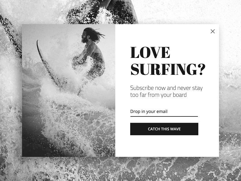
The science behind
The surfer image is highly resonating with its target audience, it is strong & emotional.
Black & White photos affect users in many ways, in this case, it’s creating a sense of timeless drama.
Surfers don’t like to ride on high waves. So the call to action is FoMO’imsh and talks in the surfer’s jargon and so is the rest of the popup.
Who should see it
- Users who read enough from your article or blog
- Potential customers or users who show a medium interest to purchase
- Users who match into your content followers personas
Email subscription popup that embraces a sense of uniqueness
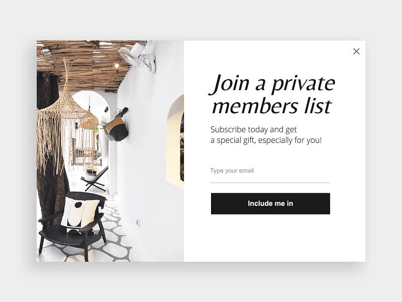
The science behind
We, humans, are getting very curious when we hear about something exclusive.
Giving users a chance to ‘get in the club’ might make them enough emotional to seal the deal & give you their email right away.
The picture of a luxurious room in an exotic location makes the user’s brain to scream “This is exactly where I wanna be right now!”.
In addition, the simple and clear language keeps the users emotional so they positively respond to the call to action.
Who should see it
- Users who fit into your followers’ personas
- Users who are on the starting point or mid-way of your funnel
- Returning users who are showing a weak interest in your product
A cutting-through email lead popup for serious users
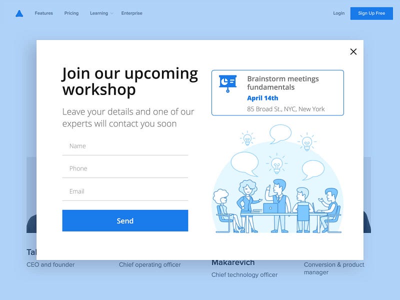
The science behind
A direct approach is the best approach in many cases. If we simply want people to join our workshop, let’s write exactly that.
The colors, language, shape, illustration, and call to action are all simply because the last thing we want is to distract the viewer from the main message.
Who should see it
- Heavy users, i.e returning users who read more than 1 article on your blog
- Users who match into the event personas
- Users who you have no doubt will join, i.e by using online events we can apply with Adoric
Email capturing popup that speaks personally to your audience
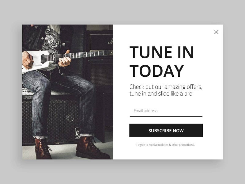
The science behind
Fitting your offer to the user jargon is a form of art.
Tune in and slide like a pro are a strong way to tell musicians: ‘sign to our newsletter and get awesome tips to improve your musical skills’.
The image of a guitarist doing a common-to-guitarists thing proves to your audience even more that you understand them.
This popup is all about proving your audience how connected you are.
Who should see it
- Users who love your content or products
- Users which are similar to your best personas
A magnetizing email subscription popup
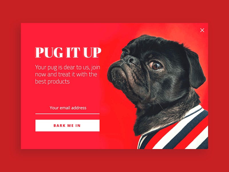
The science behind
Pugs are beloved, the red color is magnetizing, and the right typography highlights announcements.
Everything here is set up to steal the pug owner’s attention.
The wording makes sure we understand the point and not just getting dazzled by visuals.
Who should see it
- Returning customers and users
- Users who are similar to your top personas
The lightest email collecting popup ever made
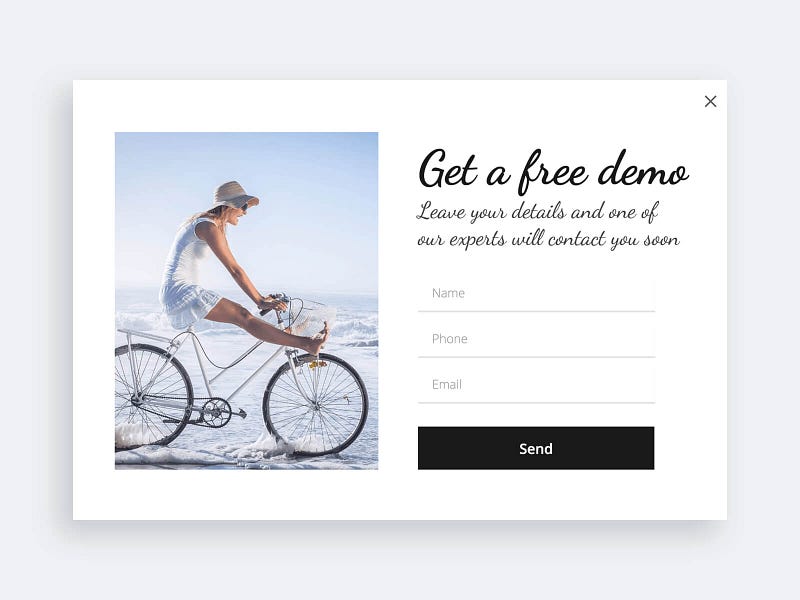
The science behind
No one love to talk with a salesman about demos, people precept it as a heavy thing.
So why not refute it at a glance?
Here we refuted it with a light design, typography, and photo. notice that there is nothing special about the words or offer over here.
Who should see it
- Customers and heavy users
- Users who fit into the personas will attend the event
- Users with high chance to join
Emotional email promotion that pushes a call to action
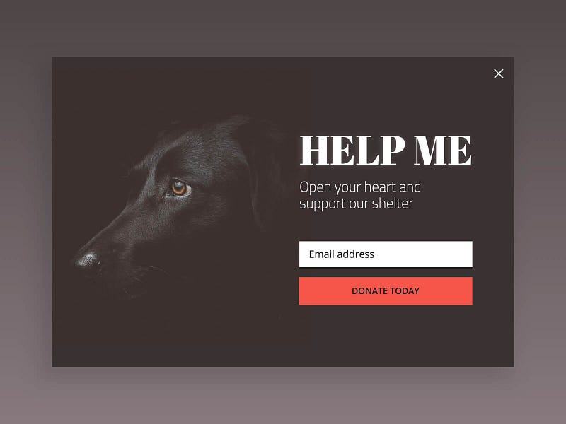
The science behind
The elements in this popup are creating sadness in the user mind which gives the call to action power to be a situation changer, this is a strong CTA.
The dog is swallowed in the dark. The title calls the reader to help and the subtitle is a persuasion boost.
Finally, the call to action comes with a strong-red sense of emergency
Who should see it
- Users who match into converted personas
- NOT existing subscribers or users (they should get directly the email)
A popup to capture viewer’s email & imagination
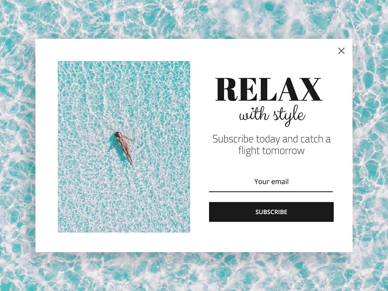
The science behind
A strong photo that strongly correlates with text is important for clarity.
Our message of a super relaxing vacation with a style is transmitted in both, the photo and titles.
In case the subconscious is not convinced yet we capture the imagination by saying ‘catch a flight tomorrow’.
A fresh language also proves that we know a thing or two about style.
Who should see it
- Users who consume your related content or products
- Test on personas you barely know (How can you fail with this super positive popup?)
Exit-intent email capture popup that improves user retention
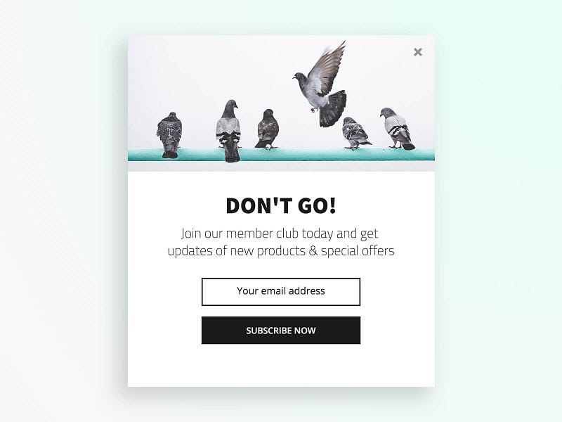
The science behind
Exit intent popup can be tricky, it has to have a good incentive in order to succeed.
And you should show them only to people have shown some interest in what you are offering, if not the leaver will leave with a bad taste.
This offer will look good to users already shown interest, it is mellow and quick.
The title and photo are dramatic in a humoristic way, which is a great way to let people leave with a good taste.
Who should see it
- Users who read enough from your article or blog and are about to leave
- Users who show enough interest and are about to leave
- NOT users who didn’t indicate enough interest
Interesting email subscription popup to build a list of hot potential customer

The science behind
How would you know who is interested in your new arrivals?
Just let the curious people left their email and there you go. The combination of 3 well-taken photos in one popup will make sure that the right users will subscribe.
All the wording and the hot & new badge make sure the right kind of users will get even more excited.
The final line is to debunk the suspicion of some people, it can be used in any email subscription popup.
Who should see it
- Users who match into your personas, i.e use redirected from a specific page or post
- Users you want to test to convert, i.e users don’t match any of your personas but checking your product collection for a certain time
Email subscription popup to put the hottest users in your pockets
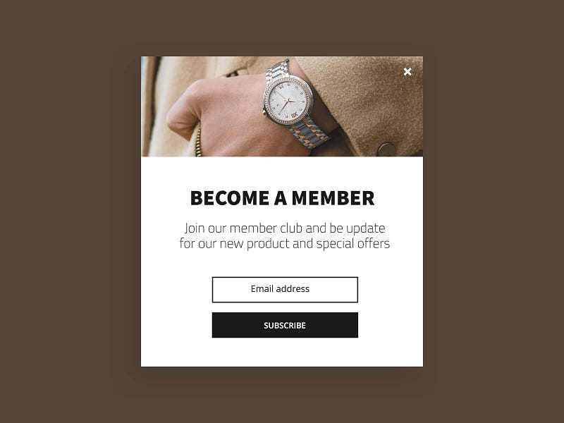
The science behind
A strong correlation exists between the picture, design, and wording. This popup transfers luxury in all means. Right wording is crucial.
The words ‘member’, ‘club’, ‘new product’, ‘special offers’ are right in their place to make users want to join besides getting a sense of luxury.
A direct approach is best in this case, let the popups elements speak by themselves.
Who should see it
- Returning users
- Users who match to your best personas